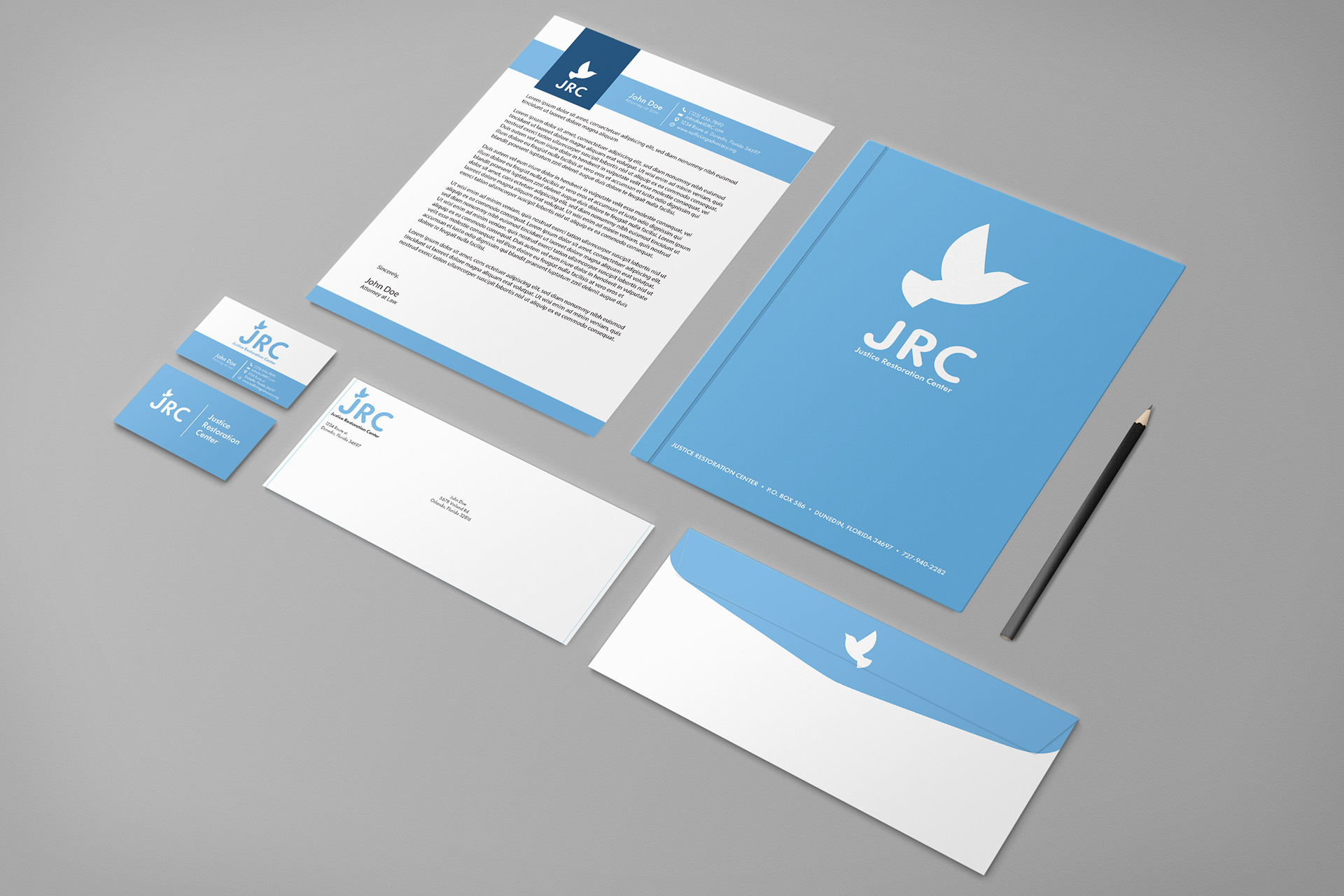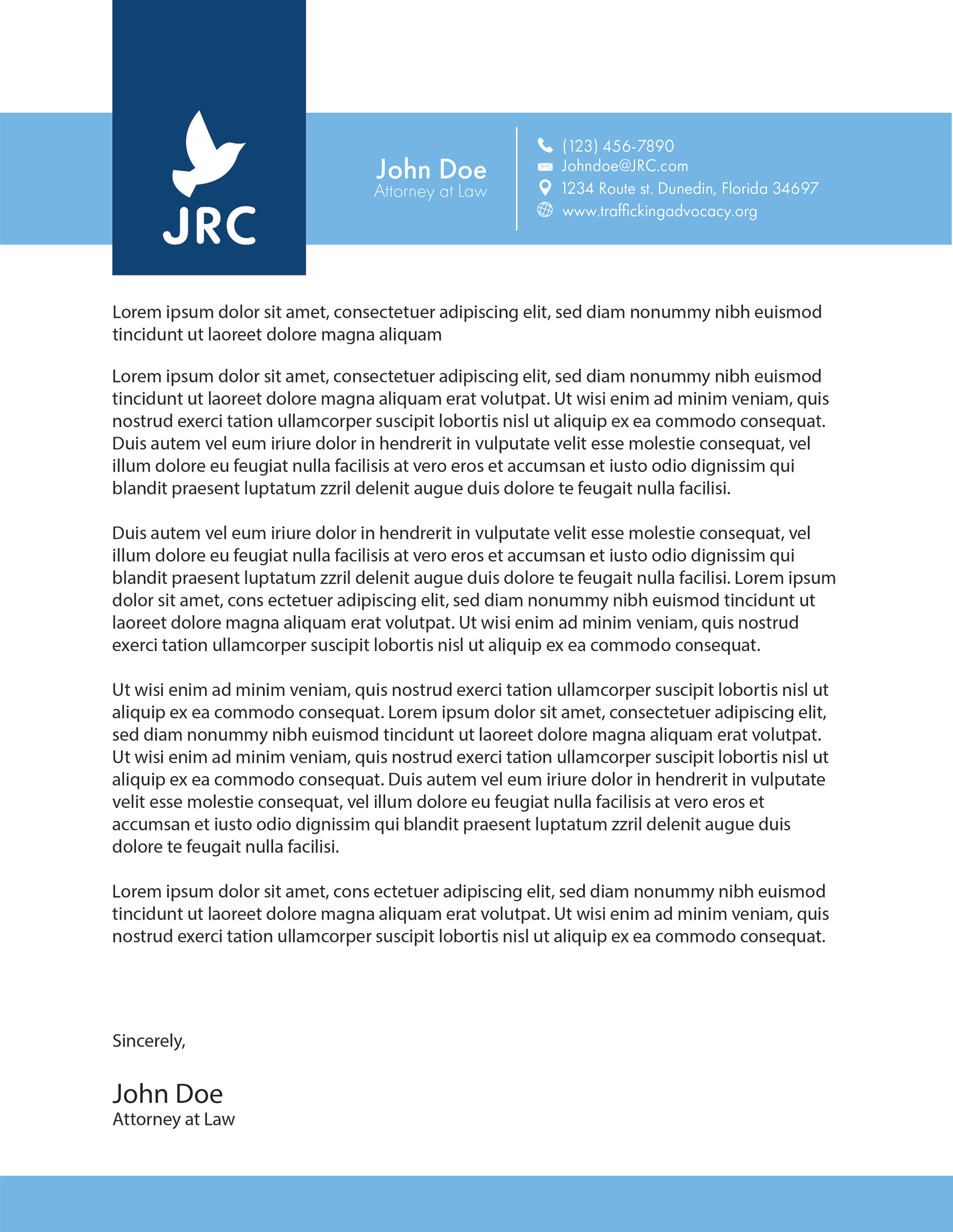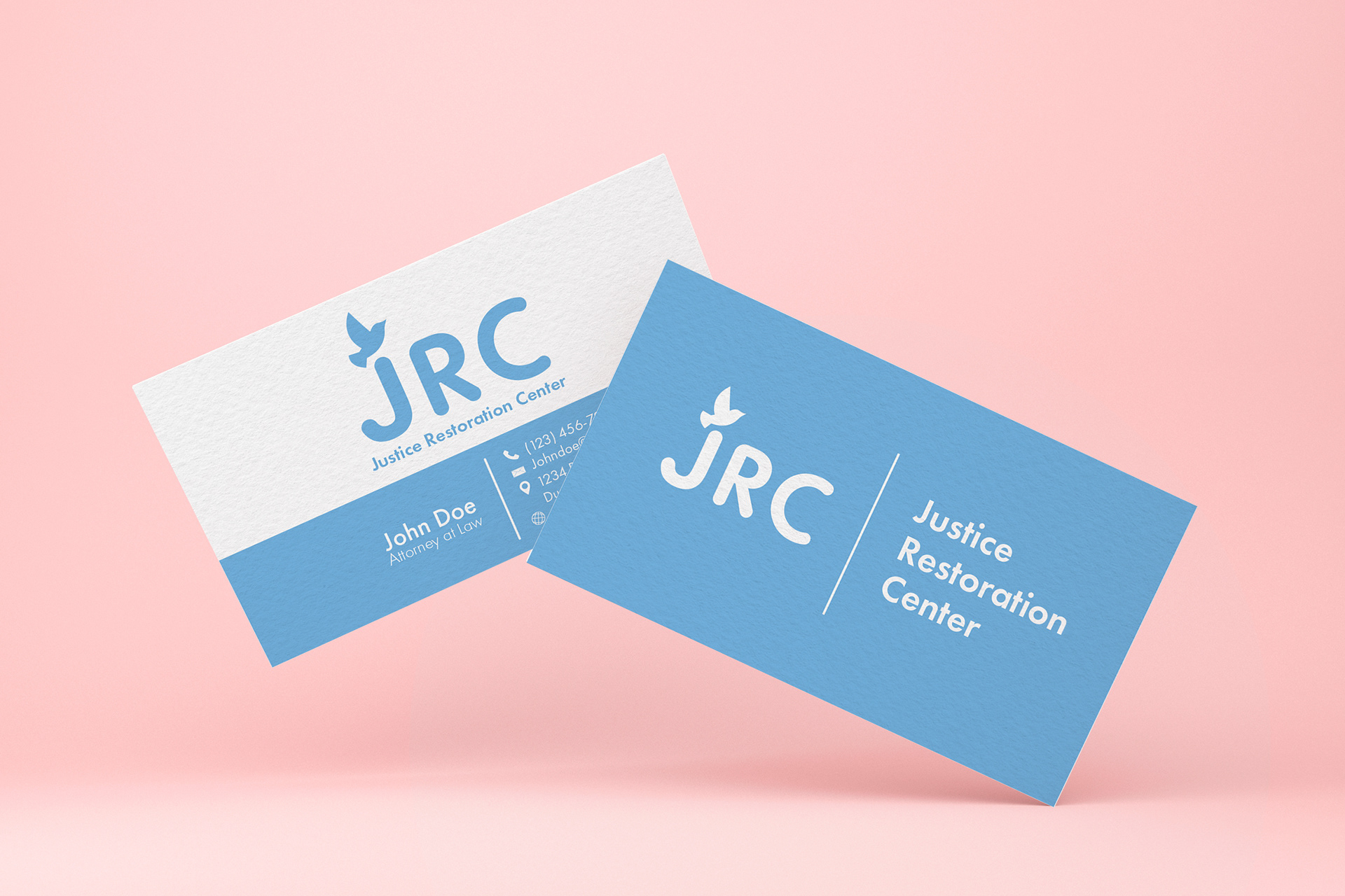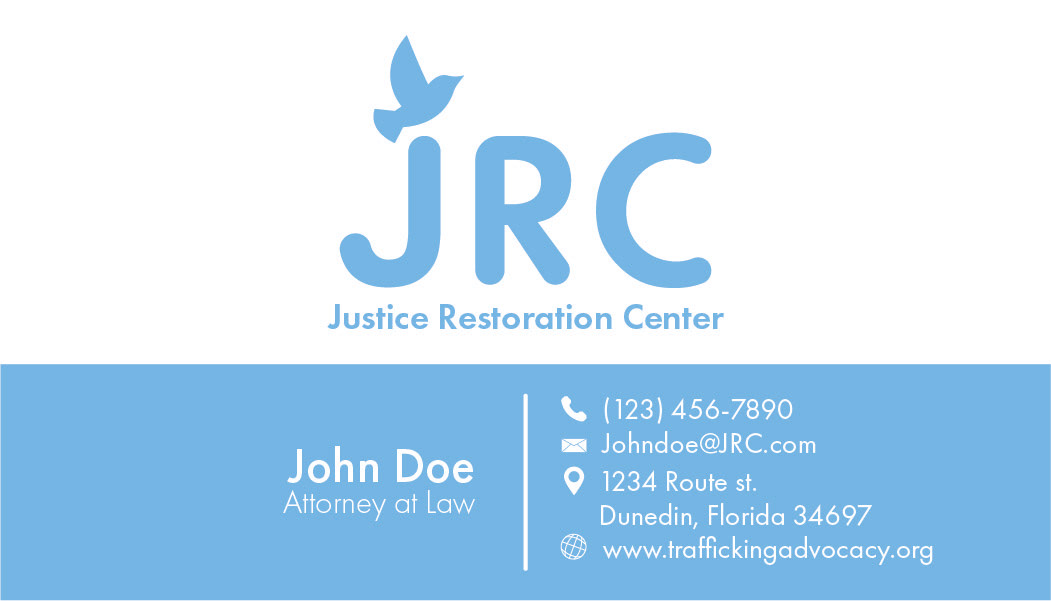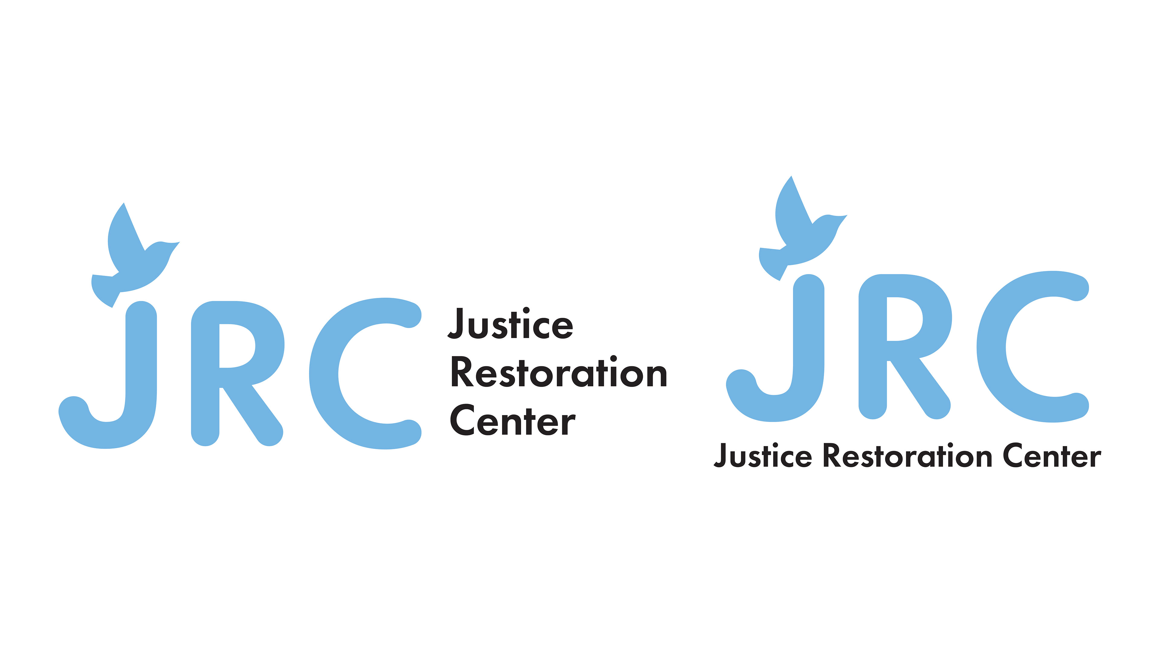
Justice Restoration Center is an existing law firm that
helps victims of human trafficking. Due to the heavy
subject matter, I wanted to give the brand a feeling of
safety, peace, and freedom.
The main image that I used was an illustration of a dove
as a symbol of peace and freedom. The dove shows a
sense of freedom from being bound and has a calming
presence. When it came to the colors, I chose a mainly
blue palette as it is commonly seen as a calm and peaceful
color, but I tried to be aware that it can also be seen as
a sad color. With that in mind, I avoided using deeper
shades of blue and when I did use it I made sure to use
it in small amounts.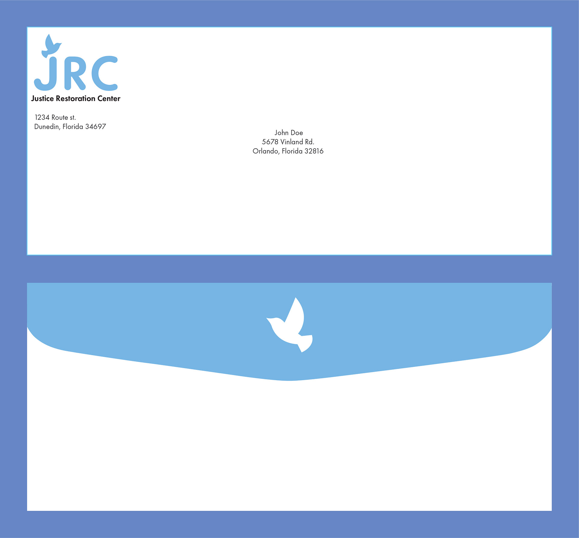